
GRAPHIC DESIGN
Bonner Springs Water Logo
Service
Client
Industry

The Challenge
Bonner Springs, KS, was infamous for its hard, "gross" drinking water. For a town named after the natural springs located in the area, this was unacceptable for residents.
In 2024, the town built a new water treatment plan. In need of a logo that represented this new, exciting era while keeping the history of the town logo and namesake in mind, they turned to SMPL Design. Co.
Our Solution
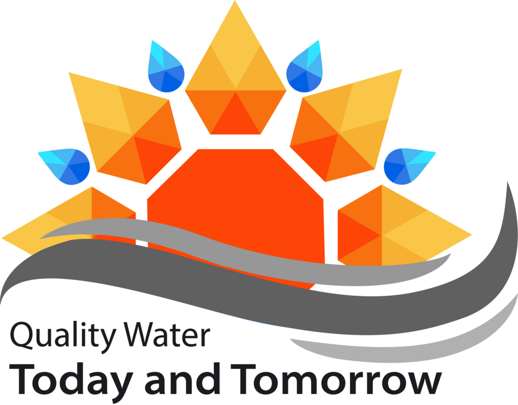
By transforming the town logo, a sunflower, into a rising sun on a wave, SMPL Design Co. kept that desired bit of history in the water plant logo. Water droplets were added above the town sunflower, to properly represent the public works department.
Finally, three waves were added underneath the sunflower. Multiple wave iterations were considered, but ultimately this wave format best represented the water source the town draws their water from. This connected back to the "Springs" in Bonner Springs, showing more town history and pride in three lines.
The slogan was chosen from a collection of potential slogan iterations. This slogan best represented the excitement for a new day dawning. "Quality Water" was meant to send the message that the water treatment plant is going to drastically improve the quality of the drinking water. Residents of Bonner were concerned this would not be a lasting effort; the the text "Today and Tomorrow" was chosen to show this change is never going away.
Multiple color and black and white final designs were sent to the City, for use in social media, on the website, and on products like water bottles.
