
HISTORICAL ORGANIZATION WEBSITE REDESIGN
KanColl Website Redesign
Service
Client
Industry
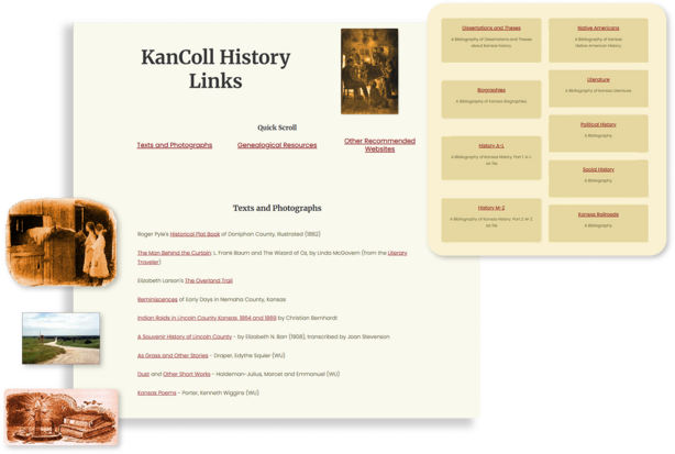
The Challenge
A historically rich website, collecting published works about Kansas - whether the author travelled through the prairieland, the song mentions the Sunflower State, or the photo depicts rolling fields of wheat.
This website was created in the 90's and last updated in the early 2000's. They needed bigger, easier to read text, broken links from retired websites removed, and cleaner navigation. "Looks should resemble the Kansas landscape, and navigation should be understandable", were the biggest requests.
Our Solution
The KanColl site is so huge and the organization wants to take this project one step at a time, so the 5 most important pages were redesigned to start this off. Light yellow and browns were chosen for the colors, and we made sure to keep the pages clean and simple. Since this project is ongoing, a redesign paired with website maintenance, links are constantly being monitored throughout the entire catalog.
Plus, the simple windmill graphic was created for the organization as a new logo. This graphic has deep ties to the roots of the nonprofit and they wanted to keep those ties strong, but didn't have access to the original windmill image. Just another bonus of working with SMPL Design Co. - website and graphic design, all in one business!