APP PROTOTYPING
Bliss Wedding Planner Prototype
Service
Client
Industry
The Challenge
Our Solution
As a semester-long project made for a User Experience class, this wedding planner design-process included in-person interviews, competitive analyses, and months of developing interactive prototypes.
Features on this wedding planner include a sign up or log in screen, which leads to an interactive "Wedding Style" quiz. This entire prototype was designed completely on Figma, and includes over 80 wireframes. Although no conditional logic was used, different answers in the quiz lead to different style results, leading to personalized results.
As a semester-long project made for a User Experience class, this wedding planner design-process included in-person interviews, competitive analyses, and months of developing interactive prototypes.
Features on this wedding planner include a sign up or log in screen, which leads to an interactive "Wedding Style" quiz. This entire prototype was designed completely on Figma, and includes over 80 wireframes. Although no conditional logic was used, different answers in the quiz lead to different style results, leading to personalized results.
click here
Click Start
Or Take the QuizThe Process
Our Solution
The first step in this process was to develop a problem statement and begin researching. The problem statement acted as a guiding point for the entire project. This problem statement looked like this.
Couples who are in the process of planning a wedding need a centralized place to:
- Find inspiration for their wedding
- Keep track of tasks according to a timeline
- Communicate with other couples
- Connect to additional resources.
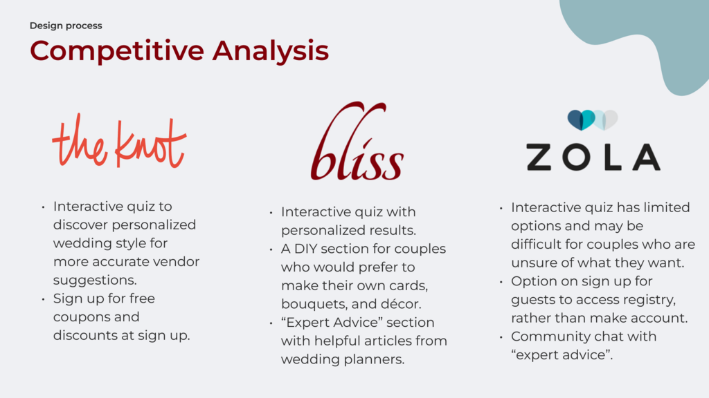
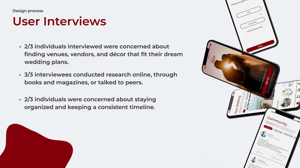
Research for this project began with a competitive analysis and in-person user interviews. From this research, user personas were developed. These represent different individuals who may be in the process of planning their wedding, their needs and wants in a wedding planning app, and a bit about their personality.
Eye-catching mouse movement, images galore, and scrolling animations. By simplifying the menu onto one page and creating a side navigation bar, customers are able to see the menu categories at all times. On mobile, this side bar is turned into easy-to-read images. With one click, scroll to each menu section quickly.
A homepage pop-up shows off the current delicious specials and makes it a breeze for customers to jump to the ordering menu. And with updated, brightly-lit images taken by adoring customers and restaurant employees alike, you know exactly what you're getting when you order.
From the research phase, user flows and task flows were developed. These showed the path the app would take after each step was completed. The beginning of the interactive quiz was created, and wireframes were started.
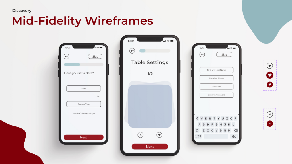
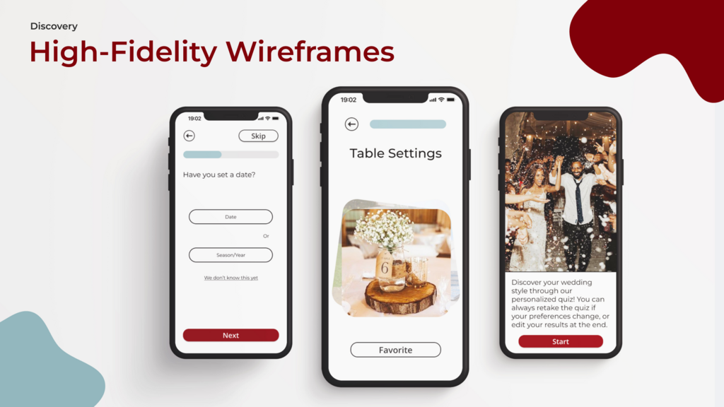
Mid-fidelity wireframes were started, with placeholder text and boxes to represent images. From here, the high-fidelity wireframes were developed. These represented how the app would look as a final product, after final edits were made. After this stage, user testing was completed. This gave important information as to what worked and what didn't.
Key Findings from User Testing:
- The Call-to-Action, labeled as a "Favorite" button (pictured in the High-Fidelity Wireframes image) was confusing and difficult to use.
- A lack of arrows made the desired actions unclear.
- The progress bar drew more attention than the Call-to-Action button.
- Original options in the quiz were too limiting, specifically the "Color Palette" options. These were described as either too bright or too dull, and felt out of place with the rest of the quiz.
Bliss Wedding Planner
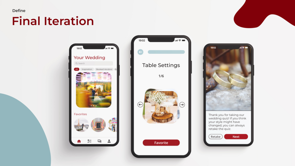
The final iteration of this prototype wedding planner includes a log-in and sign-up screen, which takes users to the Wedding Style quiz. The quiz offers users the ability to choose their favorite option between six different choices. Categories in the quiz include color palettes, ceremony spaces, reception venues, favors, and table settings. Once the quiz is completed, it takes users to their style description page. From there, it takes users to a personalized home-page. Each style has different image suggestions and inspiration, and each home page leads to a mock checklist, a community forum, and a profile page. These pages are not interactive, but were developed to show what the potential next steps could be.